PORTFOLIO

PORTFOLIO
https://www.elseernstdesignportfolio.com/
My name is Ellie Ernst. I am a junior at the University of Colorado Boulder, Majoring in Cinema Studies (with a production track) and double-minoring in art practices (with an emphasis on studio art) and English (with a creative writing track).
ELSE (ELLIE) ERNST
Writer and Artist
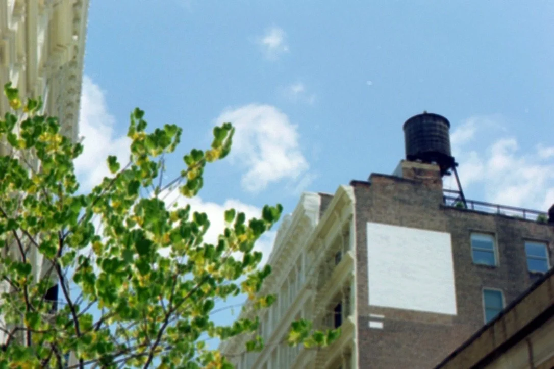
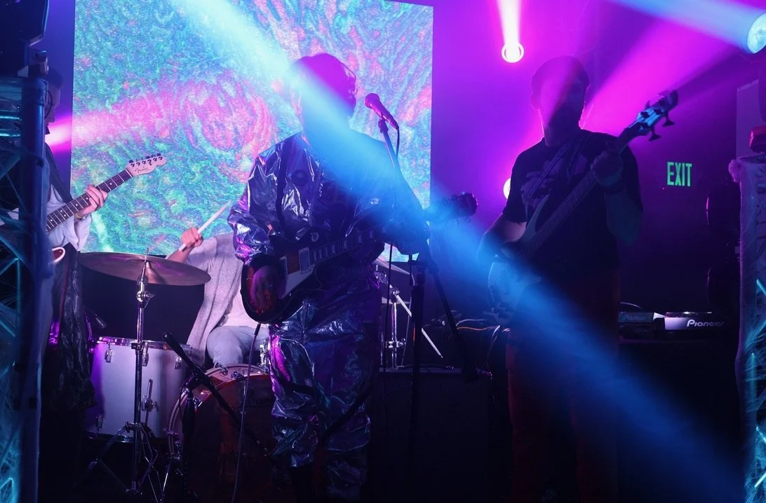
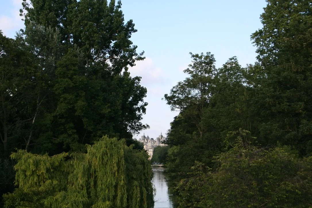
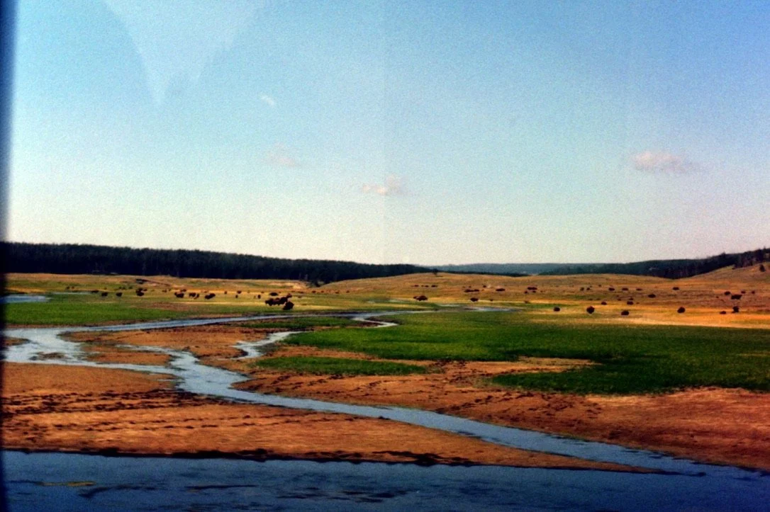
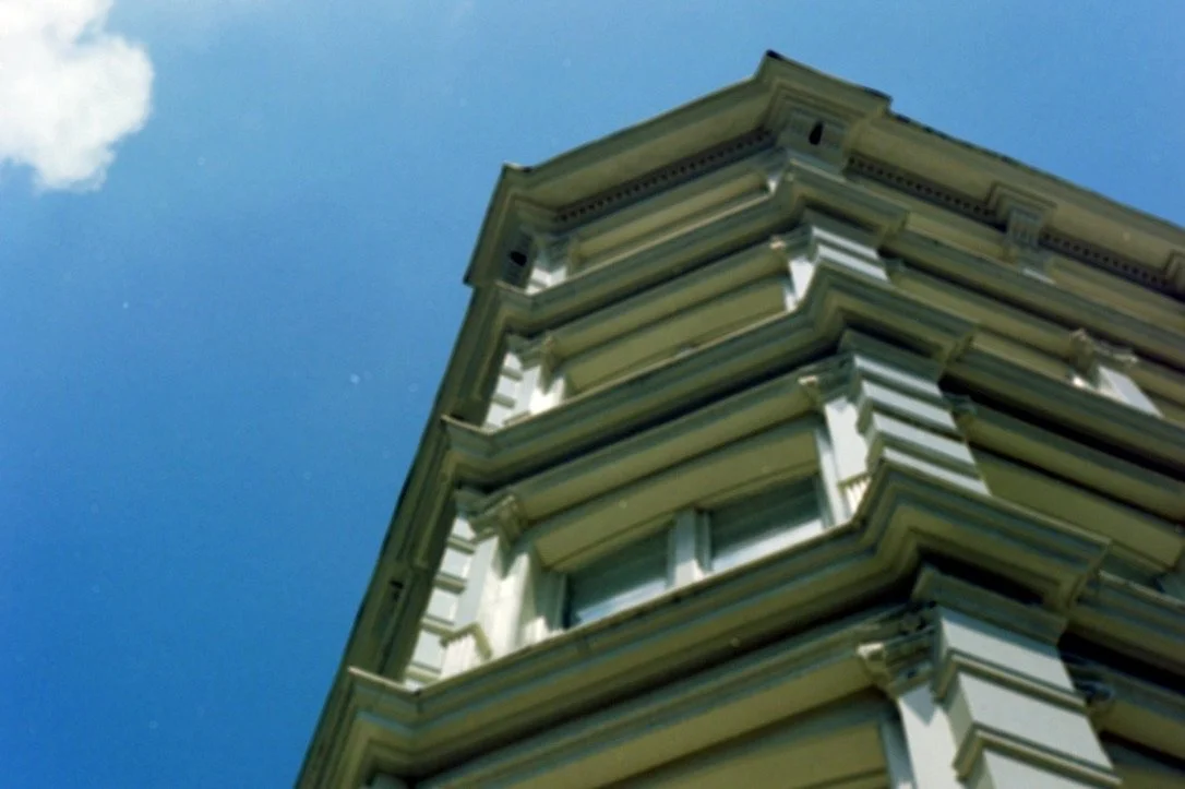
PhotographyDigital Photography:
Film Photography:


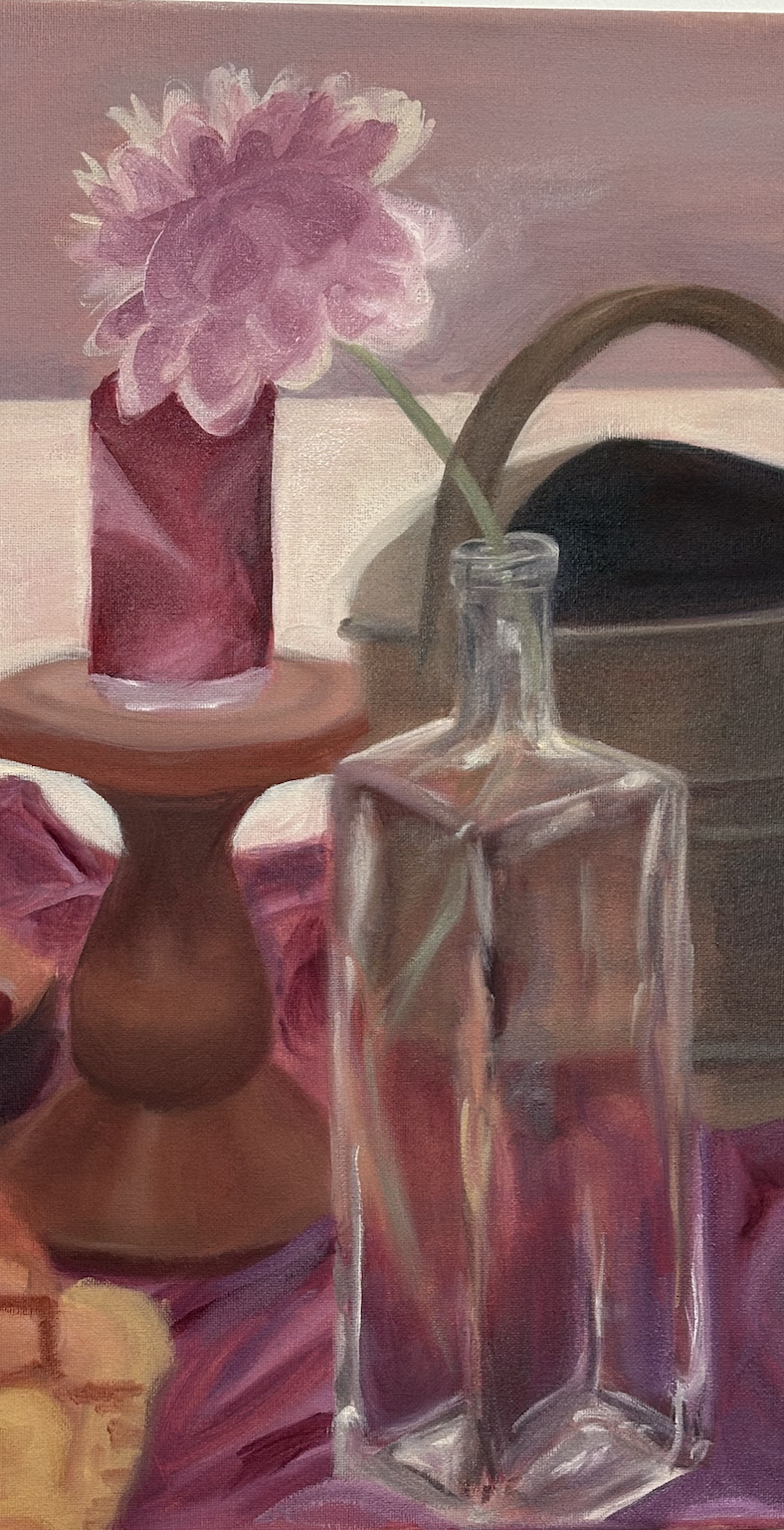
Writingstudio art

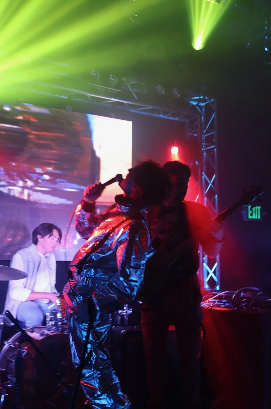
short films EVELYN
02/10/2026
Starring Evelyn Barnett
Created by Else Ernst
Shot on a Canon XA60
This film was created for my CINE 2000-003 class. The assignment was to create a silent portrait film of someone whom you admire in your life. I chose Evelyn because she is charismatic, passionate, and has a beautiful connection to music. The challenge was portraying musicality without using any audio. This is my take on the assignment.
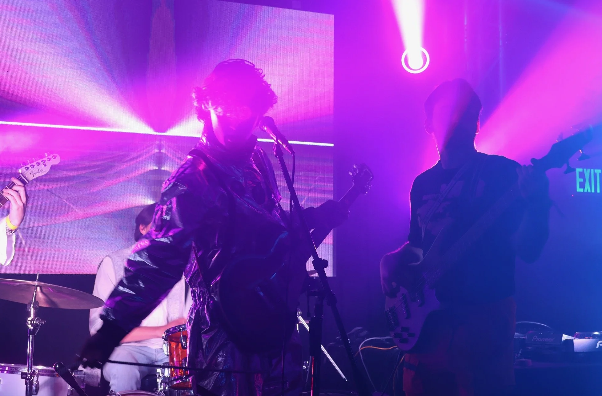
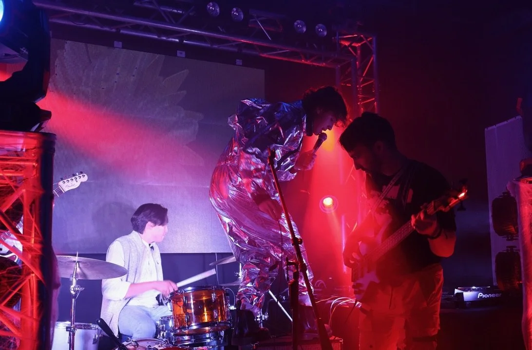
Easier to Forget
04/23/2026
Starring Else (Ellie) Ernst, Charlotte Reinhardt, Kiera Simmons, Madison Jacoway, and Marlee Presgrave.
Created by Else Ernst
Shot on a Canon XA60
This film was created for my CINE 2000-003 class. The assignment was to create a narrative using color. The idea for my film stemmed from the movie Paris, Texas. I loved the aesthetics of Jane in the pink phone room, and then the contrasting colors at the gas station, with the sunset in the background. I watched a few films in preparation for this assignment, including Pierrot le Fou. I loved this film, and the colors and use of synthetic lighting were absolutely captivating. For this assignment, I mainly took inspiration from the colors of the party scene at the beginning of the film. I want to contrast the real world with what happens in our heads during a night out. Colors are amplified; things don't seem as grounded in reality. When I show the kitchen in the morning, I wanted all natural lighting to ground the viewers before sending them into the hangover. The hangover, to me, needed to have all the colors so you could actively see each memory/feeling wash over the main character. There are so many conflicting emotions after a chaotic night, and I wanted it all to reflect that.
Main colors used in the film:
Pink: I was inspired by Paris, Texas (as stated above), but I also wanted something that felt girly and fun, with a little bit of an unsettling undertone. It's a dark pink bordering on red; it's fun bordering on something darker.
Green: I felt that green is a beginning, like green for 'go' on a stoplight. It is the beginning of the night, and they are gearing up to go out, naive to what awaits. The green I used isn't a threatening tone, but the high contrast creates more depth and layers to its meaning that I really enjoy. The green also feels a little sickly to me; it covers a whole range of feelings, which is exactly what I needed the pregame to depict.
Red: Red is mainly used at the end. To me, red feels restless; it is anxiety that makes you feel like you are crawling in your skin, in the right context. It also represents a possible sexual event that may have happened. I think the feeling of sex and anxiety also intertwines throughout the red because the character is visibly upset by her choices when she is crying on the balcony, and the red light shines on her, just as it did on the bra on the floor.
Resume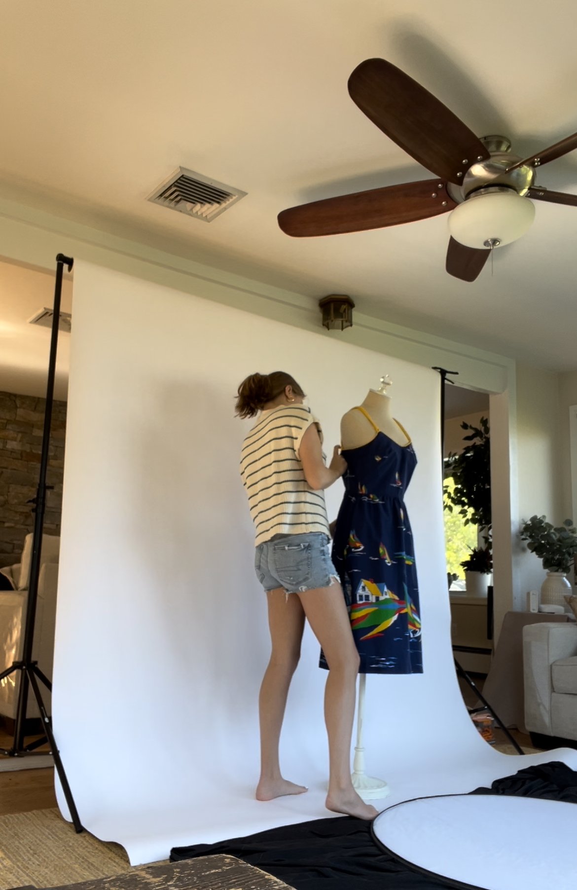

Setting up a product photoshoot during my internship with Nina Nelson Photography
Contact InfoPersonal Email: ellievernst@gmail.com
School Email: ellie.ernst@colorado.edu
Phone Number: (203) 722-4567
Linkedin: www.linkedin.com/in/else-ernst-853a94331